Is Your Website a Bottleneck or an Asset?
Your website isn't just a digital business card. It's either working silently in the background to build trust and convert visitors: or it's confusing people and sending them to your competitor's contact form.
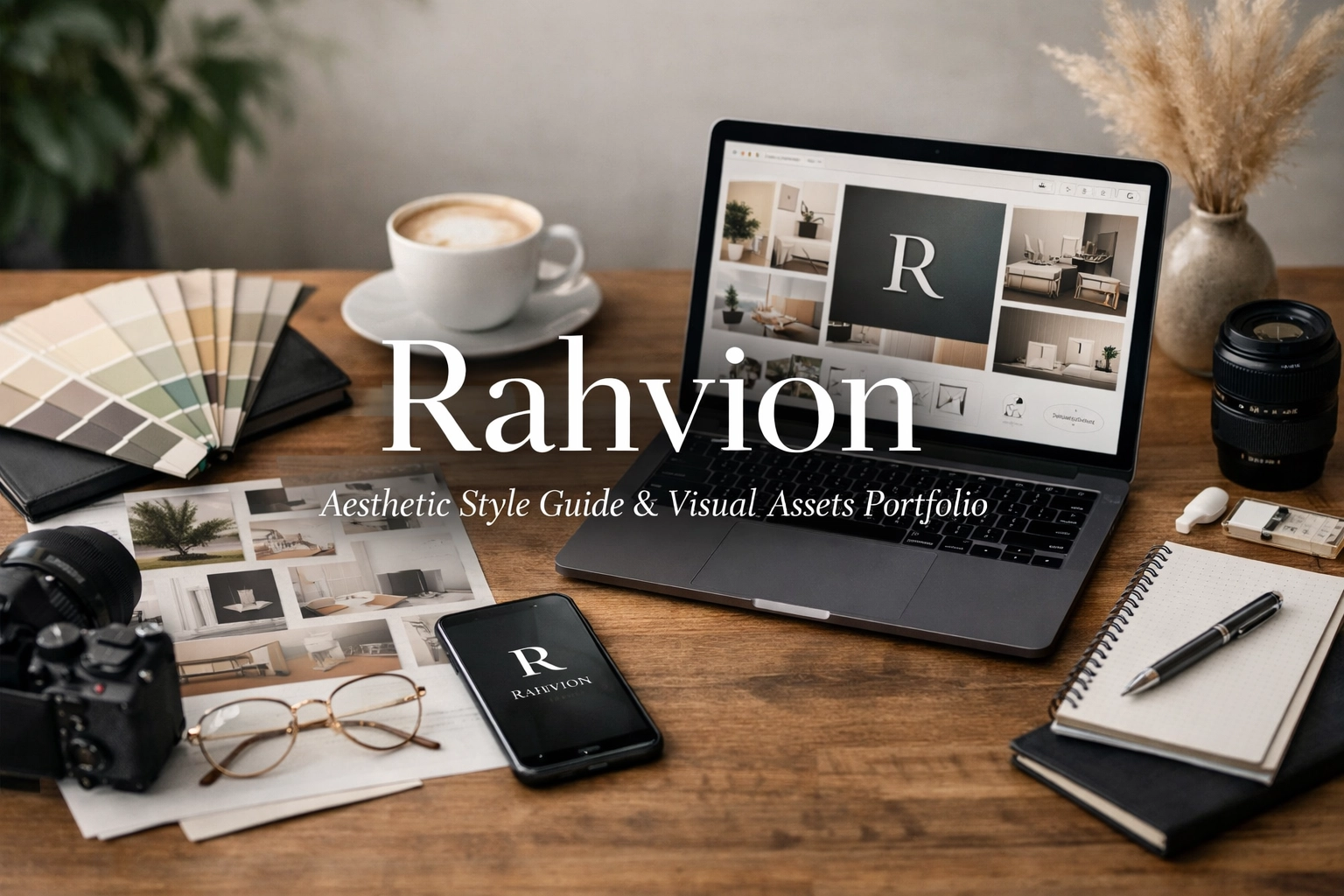
This style guide transforms Rahvion.com from a functional placeholder into a professional-grade digital asset that reflects the enterprise-level service you deliver to American families.
The Visual Philosophy: Enterprise Precision Meets Home Comfort
Most IT support sites make one of two mistakes: they go full "cybersecurity hacker aesthetic" with neon greens and aggressive tech imagery, or they swing the other way into "friendly grandma's blog" territory with soft pastels and clipart.
Rahvion occupies a different space entirely. You're bringing Fortune 500 IT infrastructure into living rooms. Your visual identity needs to communicate both sophistication and approachability at the same time.
Core Design Principle: The "Executive's Living Room" Test
Every design choice: from color selection to typography: passes through this filter: Would this feel at home in both a C-suite executive's office and their family's living room?
If a visual element screams "corporate boardroom only," it's too cold. If it feels like a consumer electronics store flyer, it's too casual. The sweet spot is professional elegance that invites conversation.
Color Palette: The Technical Sanctuary Scheme
Primary Colors
Rahvion Blue (#2B5F8F): This isn't the bright, playful blue of social media apps. It's the muted, confident blue of precision instruments and premium automotive interiors. Use it for primary CTAs, key headlines, and navigation elements.
Metallic Silver (#C0C8D1): Think brushed aluminum, not chrome. This appears in UI accents, divider lines, and as a subtle background for technical feature callouts.
Pure White (#FFFFFF): Not cream, not off-white. Clean, generous white space that lets content breathe and signals clarity.
Accent Colors
Deep Charcoal (#2C3E50): For body text and secondary navigation. High contrast without the harshness of pure black.
Safety Green (#4CAF50): Used sparingly for status indicators ("Protected," "Active Monitoring") and success states.
Alert Amber (#FFA726): Reserved exclusively for urgent notifications and security warnings.
Typography: Clarity Over Cleverness
Headlines (H1–H2): Inter or Poppins, 700 weight. Sans-serif, geometric, confident. Headlines ask direct questions: "Is Your Home Network a Security Risk?" not "Network Solutions for Modern Living."
Body Text: Open Sans or Source Sans Pro, 400 weight, 18px minimum. Nobody should need reading glasses to understand your value proposition.
Technical Callouts: Roboto Mono, 500 weight. When you reference specific protocols or technical specs (like "WPA3 encryption" or "AES-256"), use a monospace font to signal precision.
The "Subtext" Layer
Every major headline includes explanatory subtext in a lighter weight (300) and slightly smaller size (16px). This is where you shift from the question to the benefit:
Headline: Is Your Router Failing You?
Subtext: Most families lose 15+ hours per year to Wi-Fi troubleshooting. We monitor your network 24/7 and fix issues before you notice them.
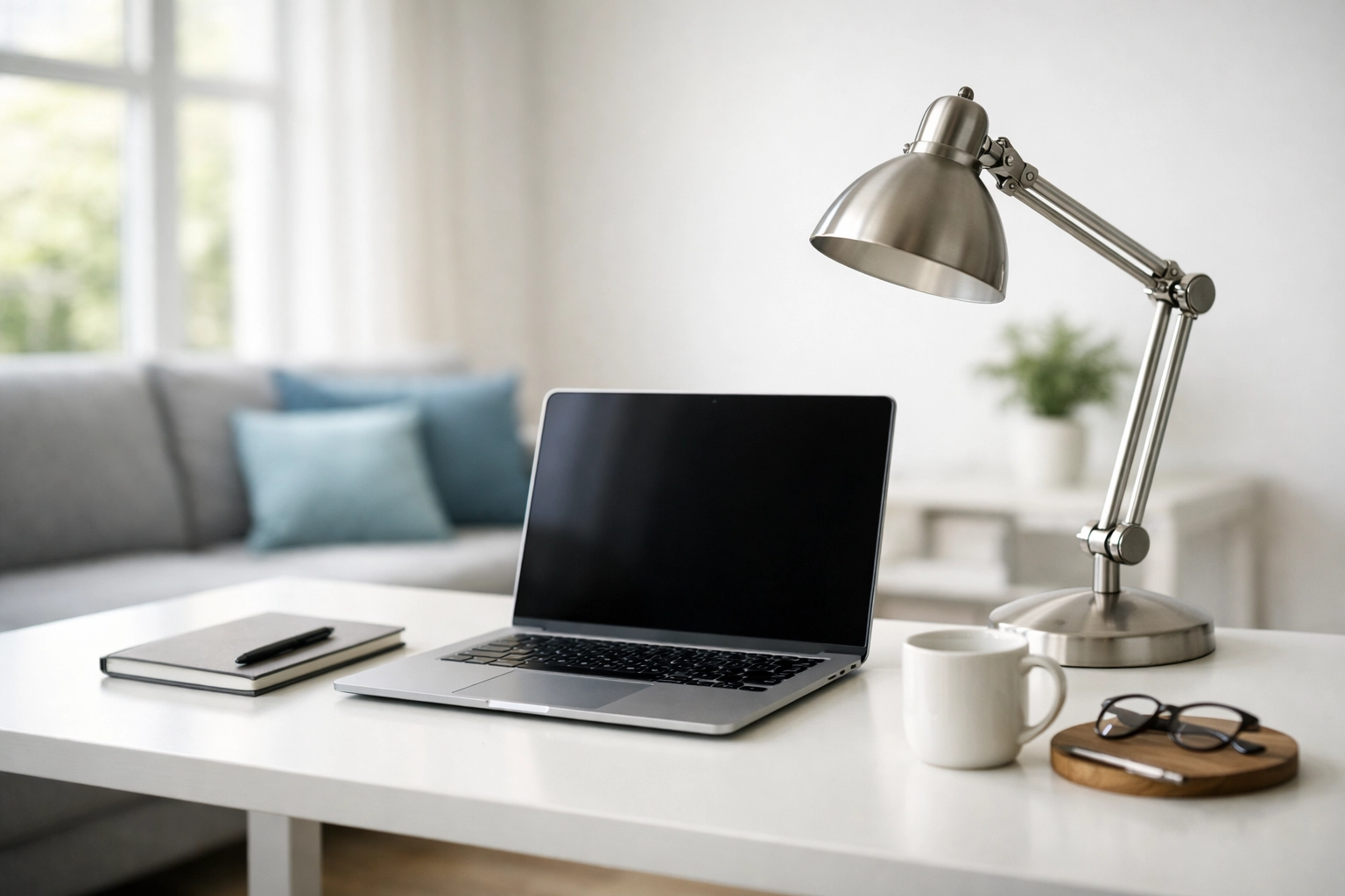
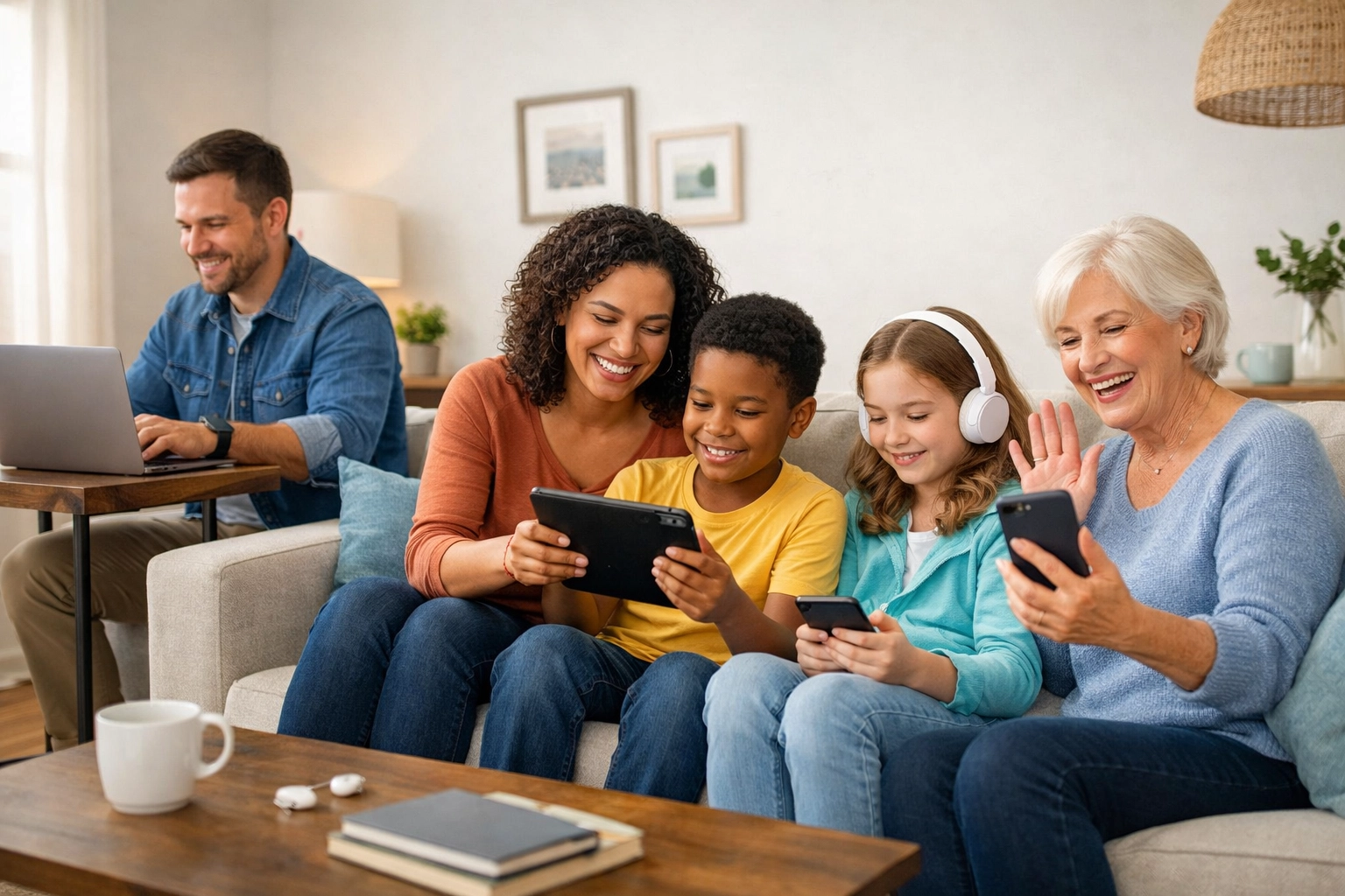
Photography Guidelines: Real People, Real Trust
What Works
The Family Asset Shot: A real family (diverse ages, natural setting) using multiple devices seamlessly in a clean, modern living space. Everyone is engaged, calm, productive. The tech is present but not dominating the frame.
The Expert Portrait: US-based IT professional (30s–40s, approachable but polished) on a video call with a smiling senior. The senior's screen shows something clear and helpful, not confusing.
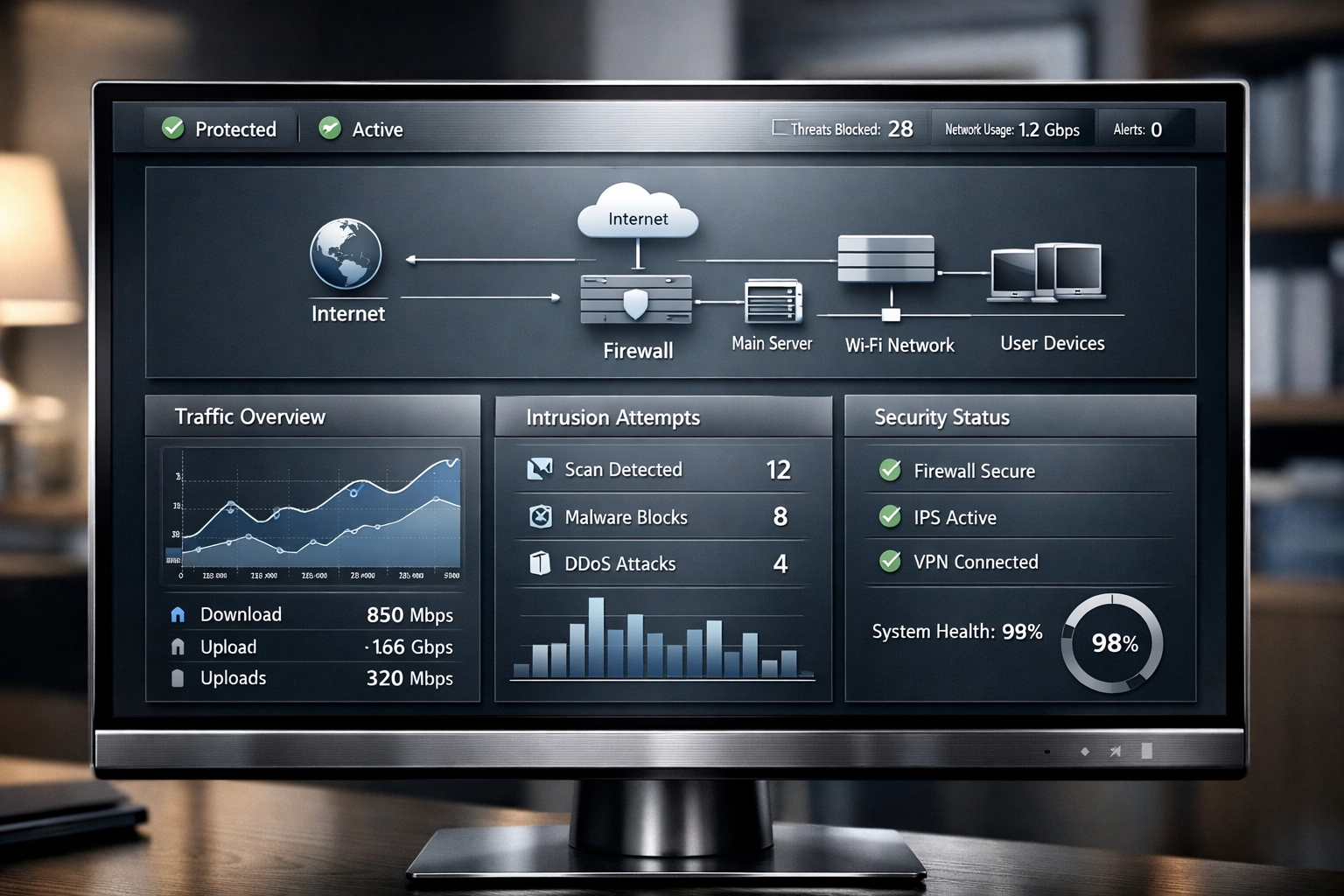
The Dashboard Close-Up: High-resolution view of Rahvion's monitoring interface. Clean data visualization, real-time alerts being resolved automatically. This is where "Anti-Gravity Auto-Healer" becomes tangible.
What Doesn't Work
- Stock photos with exaggerated emotions (pointing at screens, fake "aha!" moments)
- Cartoons, illustrations, or iconography as hero images
- Generic "person at laptop in coffee shop" imagery
- Tech gear glamour shots (routers, cables, server racks) without human context
Image Treatment
All photography receives subtle post-processing:
- Slight desaturation (10–15%) to prevent garish consumer-tech vibes
- Luminosity boost in faces and key product areas
- Soft vignette on edges to draw focus
- Consistent 16:9 aspect ratio for hero sections, 4:3 for supporting images
Layout Architecture: The Minimalist Grid
Above the Fold (Hero Section)
Left Column (60% width):
- H1 headline with subtext
- Primary CTA button (Rahvion Blue, high contrast)
- Secondary CTA as text link
Right Column (40% width):
- Hero image (always human-focused, never abstract)
White Space: Minimum 80px padding on all sides. The hero section should feel uncluttered even on a 27-inch monitor.
Service Sections
Three-column grid on desktop, stacked on mobile. Each column gets:
- Icon (simple line art, Rahvion Blue stroke, transparent fill)
- Short headline (max 6 words)
- 2–3 sentence description
- "Learn More" text link (not a button: buttons are reserved for primary conversions)
The "Trust Bar"
Immediately below the hero, a single-row section with a light gray background (#F7F9FA) featuring:
- "24/7 Monitoring" + icon
- "US-Based Support" + small flag icon
- "Family-First Security" + shield icon
No borders, no heavy boxes. Just clean, confident statements with subtle iconography.
Component Library: The Essential Elements
Call-to-Action Buttons
Primary CTA: Rahvion Blue background, white text, 16px padding, 6px border radius. Text always action-oriented: "Get Started," "Protect My Family," "Talk to a Human."
Secondary CTA: Transparent background, Rahvion Blue border (2px), Rahvion Blue text. Used for less critical actions like "Browse Services" or "See Pricing."
Hover States: Primary darkens by 10%, Secondary fills with blue background and inverts text to white.
Feature Callouts
When highlighting specific capabilities (like the Anti-Gravity Auto-Healer), use a card design:
- Metallic silver border (1px)
- White background
- 24px internal padding
- Small icon in top-left corner
- Headline + 1–2 sentence explanation
- No "Read More" links: callouts are self-contained
Testimonial Blocks
Clean, sans-serif quote with:
- 24px size, Deep Charcoal color, italic styling
- Minimal attribution: Name, relationship to tech ("Busy Dad," "Work-from-Home Professional")
- No stars, no ratings: just the quote and who said it
Navigation: Clear Hierarchy, Zero Mystery
Primary Navigation
Sticky header (white background, 1px bottom border in Metallic Silver):
- Logo (left-aligned)
- Four main links: Services | For Families | Pricing | Support
- CTA button: "Get Protected" (right-aligned, always visible)
Footer Navigation
Three columns:
- Company: About, Careers, Contact
- Support: Helpdesk, Knowledge Base, Emergency Service
- Legal: Terms, Privacy, Security
Bottom bar with copyright, phone (410-429-8159), and email (helpdesk@rahvion.com).
The "Bottleneck vs. Asset" Visual Language
This messaging framework extends into your design choices:
Bottleneck Imagery: Whenever you illustrate a problem (slow performance, security risks), use muted, slightly cooler tones. The person in the photo looks mildly frustrated: not enraged, just stuck.
Asset Imagery: Solutions are shown in warmer lighting with visible relief. The same person is now engaged with their device, productive, relaxed.
This contrast creates a visual before/after narrative without being heavy-handed.
Accessibility Standards: Enterprise-Grade for All
- Minimum contrast ratio of 4.5:1 for body text, 3:1 for headlines
- All interactive elements have visible focus states (2px Rahvion Blue outline)
- Alt text for every image describes context, not just content ("Family using secure home network" vs. "People with laptops")
- Captions available for any video content
- Font sizes never drop below 16px, even in mobile views
What Happens Next
This style guide isn't decorative: it's functional. Every visual choice here is designed to convert website visitors into protected families.
When someone lands on rahvion.com, they should immediately understand: this isn't amateur-hour IT support. This is the same protection executives get at work, now available for their home.
Your web team now has the blueprint to make that happen. If you're reviewing this and something feels off, reach out to Eva at helpdesk@rahvion.com or call 410-429-8159. We'll walk through the changes together.
Leave a Reply